Top 5 Web Design Trends For 2021
Every day with advancements in technology, the lines between reality and the virtual world blur a little more. With the pandemic, our times are now spent online largely, be it work or entertainment. In the last few years, web designs were focused on capturing futuristic sci-fi themes. However, the game has changed in 2021, and designers are now seeking to make websites realistic. As our online time increases, designers combine the ordinary with digital to make the virtual world lively and functional for businesses. There is no doubt that web development for online ecommerce is going under a massive change during this challenging time. Here are five design trends in 2021 that are going to stay for a long time.
- Abstract layouts and art
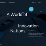
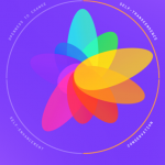
Geometric shapes such as circles and squares can make for intuitive yet straightforward abstract art not only for company logo designs but for web designs as well. Web designers are creating complex website layouts using abstract shapes that exude creativity and authenticity. In 2021, these minimalistic yet intricate imageries are taking over the web design scene worldwide. These make the website quirky, energetic, and vibrant and at the same time, give a clutter-free look.
These abstract layouts can evoke emotions and imagination without including any human images. Additionally, they can complement stock photography and illustrations by being subtle yet catchy in the background. Many websites use them in addition to animation for creating a simple effect that is hard to ignore. All-in-all abstract layouts are the next big thing and will be used in almost every other website, yet managing to make them look different.
- Parallax Animation
Web-based animation has garnered popularity in recent years. The page element’s separation into background and foreground extremes makes for complex web animation, resulting in a parallax effect. In simple words, when objects closer to the viewer move swiftly than the objects behind, it creates an optical illusion known as parallax. You will be surprised to know that we experience this daily, such as vehicles passing by when driving.
With the parallax effect, our computer screens transform into a theatre stage. This happens due to immersion created by background and foreground use. As a viewer goes through a website, this effect creates an impressive performance that seems like magic. And if one thinks about it, isn’t the internet in itself a magical thing! Parallax has intricate animations that help designers deep dive into the nuances of realism.
- Neumorphism
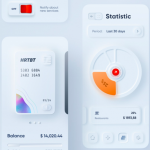
Neumorphism is primarily based on skeuomorphism, a design technique that mimics objects according to their real-world inspiration. For instance, the icon of the recycle bin is a good example. These were quite popular back in the 2010s. This was taken over by flat designs that made the icons and website graphics less realistic but easily identifiable with simple colors and icons. Neumorphism is a thread between the two that thrives on minimal realism.
It is pretty subtle in the form of drop shadows with easy flat soothing colors. Generally, one can identify it as digital embossing. Neumorphism enables designers to make flat designs interactive and tactile. This results in more engagement by the viewer on the website. You will see it heavily used on search buttons, text boxes, etc., in almost every digital platform in 2021. Even though it is laid back, neumorphism heightens flat designs intelligently.
- Soothing Colors
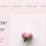
Last year has recorded the highest online time spent by users in the entire world. With such heavy usage of computers, it is common for people to face issues such as fatigue and eye strain. In 2021, web designers are more focused on creating designs that are soothing and calm by using light colors and warm gradients. To counteract overstimulation, designers are leaving large areas of the website white. This creates a pleasant experience and lets the user work for a longer period.
Calming hues as per color psychology in designs have always been a favorite among designers. But recently, they have become quite popular. In past years, sudden pop-ups with catchy graphics were a trend to gain a consumer’s attention. Now, it is more about revealing information as the viewer navigates through the website. Soft color palettes also give a leeway between two extremes of extreme white or dark mode.
- Fascinating Questionnaires
A typical user decides to stay or leave the page within a few seconds. It is the most difficult thing to engage them and create a meaningful experience. Gone are the days when a user will read a product’s description and make the final decision by themselves. This approach may not work, and the consumer may have a negative experience due to making a wrong choice.
Questionnaires are a personalized and practical solution that not only hooks the viewer but gives a customized suggestion for their requirement. Many brands and businesses are already leveraging this and gaining more loyalty from their customers. These quizzes subtly suggest products keeping in mind the customer’s preferences. Also, they help in collecting data about the likes and dislikes of the consumers for future reference.
Conclusion
Web designs are taking a more personalized, emotional, and minimalistic shape. Now, it is more focused on solving the viewer’s issues than marketing aggressively. It is a known fact that a loyal consumer will stay with the brand and uphold its name. Hence, these web designs are more user-centric that will help brands to connect with their audience.
Greg Shane
This post was researched and written by Greg Shane – Ghostwriter, designer, and crafter of high-quality blog posts. A big thanks Greg – great work, as always.

